Wearing color is a community service
How I'm doing it this summer
Welcome to Concorde, Blackbird Spyplane’s “women’s vertical” that the fellas love as well. Every edition is archived here.
Our guide to how to dress when it’s too hot and achieve Swelter-Weather Swag just dropped.
I recently saluted a trove of outstanding hiking sandals.
The best natural fiber activewear is here.
We don’t run ads and we never use affiliate links except for one-off secondhand gems we find on eBay and books on the independent bookseller Bookshop. We laid out our anti-spon position here.
I (Erin) kicked off this year by wearing black for a month straight. Over that long, dark month, I realized how deeply color affects my mood. And I’m not just talking about the clothes I wear: Seeing someone dressed colorfully walk towards you on a dour city sidewalk is like stumbling on a Helen Frankenthaler in a parking garage — you thought you were one place, but suddenly you’re in another.
As the world becomes increasingly grey-toned (a phenomenon we first reported on in 2022), wearing anything other than black, grey or navy has come to feel like an act of community service. Like planting flowers in a median, dotting our environs with color is a pro-social move. So I’m committed to wearing even more color this year than I normally do — and I feel compelled to get ‘Corde Nation to join me.
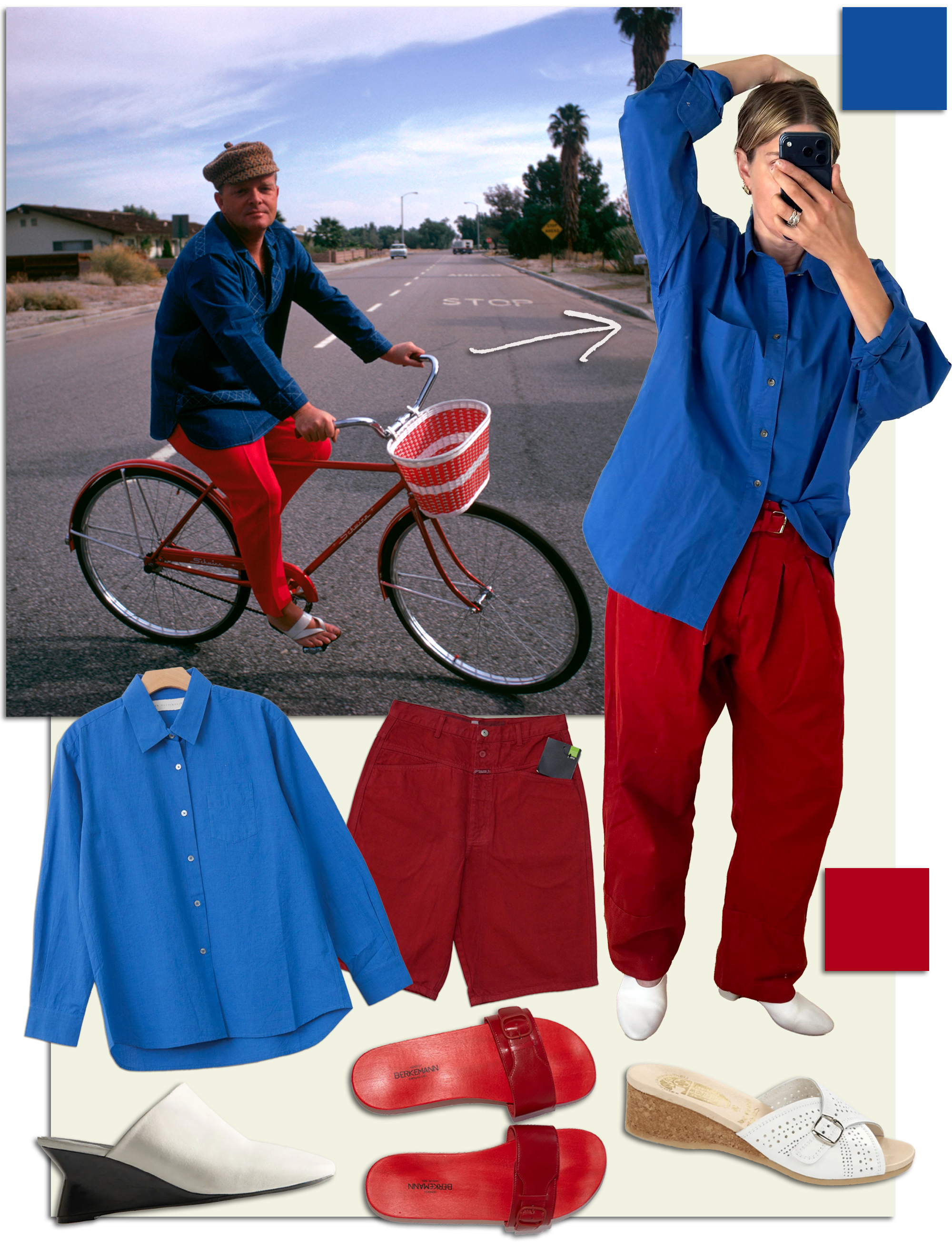
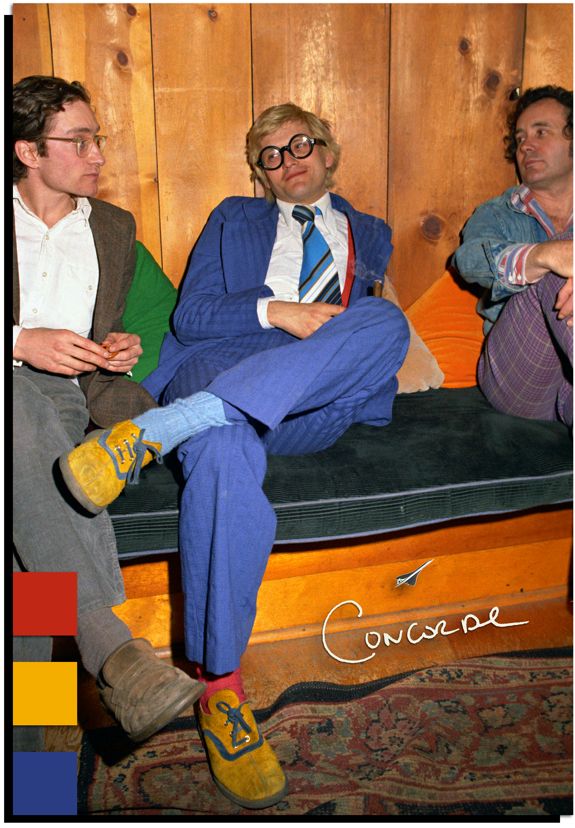
Summer is the best season to experiment with color. My own hot-weather vibe takes no small inspiration from the late, great David Hockney — the most summery painter of the last 50 years? — pictured above in a glorious red, yellow and blue fit. Look at that sly smile… Hockney knew joy was not made to be a crumb.
In today’s Concorde I’m breaking down the ways I’m adding color into my outfits right now. We’ve got:
How to embrace unadulterated primary colors and make them work
The secret chromatic weapon that is a metallic accessory
Photo-print garments — a one-and-done way to add color
Some of my favorite books, artists and color systems to consult when putting palettes together
Let’s get to it —
There are colors you look great wearing, and there are colors you feel great wearing. I probably privilege feeling over look, but never want to sacrifice the latter. (As Jonah wrote about earlier this month, neither of us puts much stock in the pseudoscience of “color analysis,” and yet we both manage to look fantastic all the time… 🤔)
Right now, I’m feeling primary colors. These can trip some people up because of their perceived “unsubtlety.” But primaries are, quite the contrary, an excellent launch pad for a chromatic journey….
Let’s start with blue: