

Millennial Rebrand Syndrome
Who's still buying stuff that looks this torched?
Our brand-new Home Goods Report, bursting with things to enliven the place you live, is here.
Mach 3+ city intel for traveling the entire planet is here.

Here at Blackbird Spyplane we keep it 99.999% positive. But today we’ve got to levy an official Holy Decree against “Affluent Millennial”-coded packaging … it’s beyond torched at this point, and yet people keep pumping it out.
When Erin and I (Jonah) encounter a product that presents itself to the world this way — whether it’s got a twee 2-D cartoon or label copy that says, like, “Hey! Yeah you. Our small-batch harissa is 100% awesomesauce” — we assume it’s $18 and mid, and we give it a miss.

Obviously some things that look like this work / taste great. But you know that thing about how 1 in 200 men are descended from Genghis Khan? These days it feels like 8 in 10 “brand identities” are descended from 2015 Casper Mattress ads. Why do tinned sardines need to look like a storybook? Why does a hummus need to say it has “sunny vibes”??
This is what I want a tub of hummus to look like:

Oh baby. The label looks like it was printed on an inkjet, with some clip-art palm trees tossed in to keep things lively. There is no cartoon of a bird juggling garbanzo beans. There is no copy involving the phrase “Mind. Blown.” That’s how you know the hummus is yanking.
It’s not just about new “disruptive” gochujangs, either. A few weeks ago on IG, the Spyfriends at Dewy Dudes mourned an unlikely victim of Millennial Rebrand Syndrome: Dry Idea deodorant. The old packaging had dignity. A ‘90s-flavored verve. The pastel-hued, lowercase-font new s**t (pictured in the first collage above) is mush.
Many time-honored brands are succumbing to Millennial Rebrand Syndrome and playing themselves. Not long ago the crunchy kings at Tom’s of Maine caved, too. When we spoke to Alison Roman about how “everyone’s disrupting and it’s exhausting,” she noted that even Manischewitz (!) had Millennialized their mf matzoh boxes.
Presumably, cursed consultants are convincing all these brands to switch things up to “stay current,” i.e. pander to Affluent Millennial Spending Power — despite being legends who should act more based than that. Big shout out to stalwart GOATS such as Bragg and Bob’s Red Mill for resisting this scourge where other titans have faltered.

Here at Blackbird Spyplane we might still cop from the Fallen — but we shake our heads and shed a tear as we do.

Maybe we’re too close, though, temporally speaking, to judge this current design era with total clarity. Maybe Millennial-Spending-Power Packaging, when you zoom out far enough, is not as uniformly repellent as it seems right now.
When it comes to “trustworthy” consumer products, we’ve been wired to favor the familiar over the foreign, even as part of us craves novelty. Over time we often concede that some product’s new look, while it initially registered as lame, grew on us. Sometimes we even admit that “they actually kinda cooked with that one.”
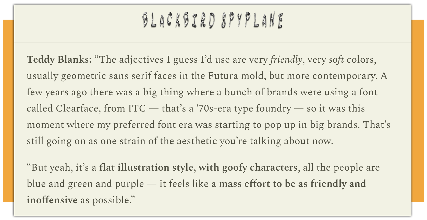
Back in 2022, when I interviewed the young graphic-design wizard and Spyfriend Teddy Blanks — who just did the very sick Nosferatu title card — I asked him to describe some of the aesthetic pillars of the Affluent Millennial look. He pointed to such recurring elements as “soft colors,” “geometric sans serif faces,” and “a flat illustration style, with goofy characters, all the people are blue and green and purple — it feels like a mass effort to be as friendly and inoffensive as possible.”
And yet Teddy also pointed out that “previous eras had design styles that were really prevalent, and we look back at those fondly … It really doesn’t appeal to me now, but I could see someone cool in 20 years saying, ‘I’m trying to reference those 2020s lifestyle brands.’”
It’s true. We’ve written a bunch about the fascinating slipperiness of Sauce Semiotics — for instance, in the context of when great logos fizzle, how “wack” people can ruin something you love, or how the “good” new Kia logo made the “bad” old one suddenly look vibey (top below).
There’s been something happening with car companies the past few years where they apparently feel compelled to update their logos to meet the electric-car era … with mixed results. These redesigns are not awesomesauce-Millennial-coded the way quinoa-cookie startups are, though their visions of futuristic sleekness are absolutely legible to a Millennial sensibility.

Erin and I f**k heavy with the old Honda logo (above below right) but we are “jury out” on the new wordmark they just started rolling out (above below left)… Meanwhile, the new Jaguar branding (above middle left) looks like it belongs on a $500 DTC air purifier that doesn’t work.
Not every “brand identity,” after all, has been as consistently and clearly touched by the Hand of God as that of, say, Sony, Olivetti, Oakley, Evian, Doritos, or the Slept-On Spyplane Design Heroes at Rain-X.
These people have served up some 5 decades of packaging excellence, somehow staying true to themselves despite several dramatic facelifts along the way. And for the present day — in an admirable controversion of Millennial Rebranding Syndrome — they’ve locked in a humble & based “AutoZone regs” look.

Ironically, though, Rain-X’s intensely slapping 1970s-era packaging, above left, could, with a few tweaks, pass for a contemporary Shoppy Shop squeeze bottle of “single-origin Dan Dan Chili oil” or whatever. You’ve got the retro font, the pleasing butter-yellow hue, and the mass of explanatory text surrounding a friendly 2-D cartoon. In the Shoppy Shop chili-oil context this would be wack. In its original form, it’s a banger.
All of which is to emphasize, as Teddy suggested, that it can be hard to declare with total certitude which labels will assume a sense of charm given enough time. And on that principle, there may be gems buried amid the currently undifferentiated awesomesauce bloat. I doubt it, but I’m too much of a Big-Brained Sagacious Pimp (BBSP) to rule it out entirely.
But there’s a deeper question I wanna go out on —

Talking through this, Erin and I got to thinking about a closely related issue: Who saves packaging anymore? Did your parents when you were growing up? Do they still? Do you?
I’ve often wondered about this exact psychology when I come across an eBay listing for some old s**t someone’s selling “with box.” Under what circumstances and in what state of mind, I think, did someone hold on to this packaging when it was new?
I kind of understand keeping the box for beautiful, big-ticket electronics, like, say a Thorens turntable. I totally get holding on to the instruction manual for something mechanical with various functions, like a Yashica T5. But saving the box for a Pentax IQZoom 160? Saving the can for some Penn tennis balls? Saving the cardboard sleeve for a promotional CompuServe CD-Rom??

The mind reels. This is the kind of packaging that, encountered now, thrums with character. The impulse to preserve it, as archival material, is obvious. But that was, by definition, not true when people made the crucial and mystifying decision to not throw them away when they were new.
In 2025 terms, these people were doing the equivalent of saving the box for a Fellow coffee grinder, or a Dyson stick vacuum, or a Cuisinart baking set…. hard to parse!

A partial but simple explanation for the phenomenon of 20th Century Consumerist Ephemera Preservation is “garages” and “attics.” That is to say, dedicated spaces for stuffing s**t onto a shelf and forgetting about it for 30+ years.
I am personally thankful for these people, because when Erin and I ordered some old Vernor Panton flowerpot pendants from Copenhagen on Etsy a decade ago, I was delighted that they came with the original boxes. And when I bought a pair of Merrell Superlight M2s off eBay that I used to own in high school, I was stoked that they arrived not only deadstock but with the little paper diagram / lacing instructions pictured above.
I’m also thankful from the broader POV of posterity, because the upshot of this hoarding behavior is that the visual history of Western packaging design has been in large part kept and catalogued by a legion of inadvertent / amateur archivists.
However!! Is this a dying practice, vestigial from a bygone time when people were capable of being enchanted by the Magic of Consumer Goods and their Talismanic Detritus in a way that’s impossible now?
Because some time in the past decade or so of Packaging Design, we came to a crossroads. And not just because the Millennial Spending Power Aesthetic is so wack. Our relationship to packaging itself has been, if not poisoned, complicated. We see it now and think — rightfully! — of choked landfills visible from space, of floating garbage islands in the Pacific, of microplastics and forever chemicals.
Brands, cognizant of this, try to thread the needle between keeping their packaging alluring while cutting down on its real or perceived “wastefulness,” i.e., making boxes biodegradable, replacing manuals with QR codes and data-harvesting apps, moving warranty paperwork online, etc.
This trend putatively serves an environmental logic. But it also reflects the rank aestheticization of environmental logic, since the true purpose, from a sales perspective, is to assuage consumer guilt about how we buy (and return) kilotons of s**t that we have increasingly come to regard as itself fundamentally disposable.
There’s been a massive change in our relationships to the things we buy, abetted by the 21st-century dominance of big-box stores, Amazon, dropshipping operations, and the torrents of cheap, crappy goods that are the lifeblood of all the above. Why would you hold on to packaging when you don’t even expect to hold on to what’s inside the package?
Our interviews with Conner O’Malley, Adam Sandler, Kim Gordon, André 3000, Nathan Fielder, 100 gecs, Eckhaus Latta, Danielle Haim, Mac DeMarco, Jerry Seinfeld, Matty Matheson, Seth Rogen, Sandy Liang, Tyler, The Creator, Maya Hawke, King Krule, Steven Yeun, John C. Reilly, Clairo, Aminé, Father John Misty and more are here.
We don’t run ads, we refuse gifts, and we don’t use affiliate links when we cover new clothes. We do use them for one-off secondhand gems we find on eBay and Etsy, plus books on the independent bookseller Bookshop. We laid out our position on affiliate links and spon here.
2015 era pentagram-designs-the-Wing is one of the most cursed propagations of Millennial branding, versus their design of Quad Cinema which works a decade later.
There’s this latter day Martha Stewart thing happening now (Sophie Buhai, Gohar World, Nine Orchard), with silverware, embroidered napkins and ironed linens, and these crazy ornamental serifs that look *fine* now, but are certainly sutured to this moment in time.
Millennials are late bloomers— i’m convinced, so maybe this is the year that collectively we grow out of the infantile hellscape of samey-ness. Personally, wouldn’t it be nice if we tracked towards style risks that embrace the stochastic and tastelessness of our world, instead of all this worthless self-soothing, smoothing, nullifying…
I’ve been pretty fixated on the branding for chlorella tablets as of late: https://sun-chlorella-usa.myshopify.com/products/sun-chlorella-tablets-500-mg