When great logos fizzle & bad logos become popping
Plus fantastic post-suit suits & culinary heat from the Spyplane Test Kitchen
Time — wow. It marches on, day in, day out… Pushing the Mach 3+ clothes-appreciator endlessly forward into the future, changing the valences of signifiers, snaking through wormholes to connect with fire moments from the past on some “Jawntum Physics” s**t … and stranding Mach negative-2 bozos in “washed” temporal ruts along the way …
Erin and I often think about the vagaries of Jawntum Physics in the specific context of logo jawns, which constitute one of the most eloquent, vulgar and deceptively complex visual vocabularies of modern fashion, baby.
Case in point: Very early on here at BBSP we did a deep dive into sick throwback Apple merch, during which we gave a total miss to early, ‘80s-era “rainbow” logo Apple s**t, which, from a contemporary vantage point, feels too overtly “retro” to pack much of a punch. Instead, we focused on merch from the Bondi Blue iMac / G4 Cube ‘90s era forward — until we got to, like, the last ~10 years, at which point the aesthetic felt too close to the present to contain many satisfying surprises or epiphanies.
Excepting some outliers, there tends to be a peak of dopeness when it comes to “throwback” logos, bordered on either side by valleys of “too old” and “too new” to be fire…
The semiotic coordinates that define these peaks and valleys are constantly shifting and re-negotiating (we’ve written about how the old Kia logo got instantly doper when the new one dropped), but here are some relatively clear-cut blue-chip cases circa 2022:
A complicating factor is that if you live through a certain “logo era” in real time you might take it as a given that one logo is the “true, golden-age” logo, based on your personal associations with it, and that others are lesser by default.
For instance, I (Jonah) first fell in love with Nike ACG s**t during the heyday of the triangle logo (middle left above). When the “lungs” logo (middle right above) came out a few years later, I was like, ‘Pffft this is hella ugly, why’d they change it, guess it’s a wrap for ACG’ — whereas someone born a few years later might likely have a very different association with the lungs, or no association at all.
In this way, my own vantage point can either be an asset (i.e. I know what’s really up) or a liability (i.e. I suffer from a generationally specific blind-spot that prevents me from perceiving dopeness that deviates from my too-rigid paradigms). In the case of ACG it’s the latter — lungs-logo-era joints have, by this point, been definitively proven to slap.
In the case of, say, the Mountainsmith logo, though, it’s a case of the former … And we see an illustration of how not all logos attain increased vibiness simply via the passage of time.
The late ‘80s / early ‘90s bags with the stitched-on fabric-logo (above left) have always looked superior to bags with the late-’90s big-anvil embroidered-logo (above right), which proliferated when the brand went supernova … that s**t looked dull and uninspired then and it looks dull and uninspired now.
We’ve chosen the specific case of logos but, in microcosm, what we’re really talking about here is the complex way all kinds of trends (in design language, fashion, etc.) bubble up and shift, and what it means, at any given moment, to be ahead of a trend, squarely on-trend, or behind a trend…
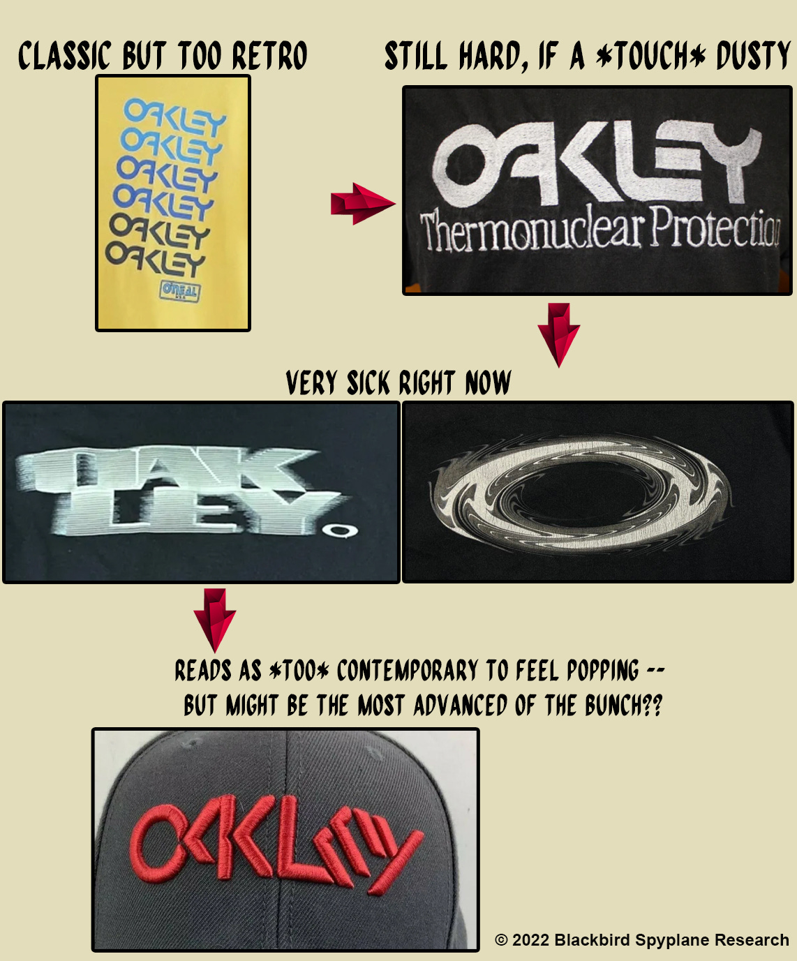
Take these successive Oakley logos, starting with a ‘70s-coded joint, passing into the ‘80s, through the Y2K era and arriving in the present with an embroidered cap you could probably go cop at Target or Dick’s Sporting Goods right now —
The newest of these logos looks way too swaglessly contemporary to be in-and-of-itself popping, and yet it contains just enough of a glimmer of possible near-future dopeness to warrant consideration all the same.
Only the most advanced Mach 6+ jawns-rocker could wear this hat in a fire way today, situating it in an ensemble / jawn-gestalt that signifies that he or she “knows what’s up,” and achieving a very sick fit despite / because of the hat’s manifestly unfashionable near-indistinguishability from currently circulating modes of “normie” mall style …
We’re talking about a circuitious and multivalent process that would leave even a Mach 3+ clothes-rocker such as yrs truly feeling a lil dizzy 😵💫😵💫😵💫.
Much to consider !!
HOWEVER — a truly wise jawns-rocker might very well just say no to logo jawns entirely, and focus instead on wearing great fabrics, colors and silhouettes, perhaps from an under-the-radar, up-and-coming designer who makes extremely beautiful, high-quality clothes that will always look good.
And O mama do we have one of those for you today —


