What makes a logo iconic?
Turbo Graphic Design Talk w/ Teddy Blanks the young font king
Blackbird Spyplane is a reader-supported masterpiece newsletter.
Our interviews with Tyler, The Creator, Jerry Seinfeld, Emily Bode, Lorde, André 3000, Online Ceramics, Phoebe Bridgers, Nathan Fielder, Rashida Jones, Seth Rogen, John Mayer, Michael Stipe and more are HERE.
Join our Cla$$ified Recon Tier today ☮️✌🏻 —Jonah & Erin
Teddy Blanks — he’s a young king in the graphic-design game, where he has been known to “freak these fonts” and “rasterize these layers” (?) while whipping up beautiful work for Spyplane-approved clients such as Todd Haynes, MoMA, The Safdie Brothers, Ari Aster, and Greta Gerwig…
As that partial C.V. suggests, Teddy — who co-founded the Brooklyn-based design studio Chips — does mad different cool s**t, but he has a SPECIAL GIFT for whipping up popping title cards, logos & posters for film & TV…

In his spare time Teddy also makes music and helps make cool, funny, idiosyncratic tees & books with his wife, Blackbird SpyFriend Molly Young, the NYT book critic and Mach 3+ surfboard-owner we interviewed here a while back — links below).
So it was only natural that we hit up Teddy on the SpyPhone for some “Turbo Talk” about decrypting the eternal secrets of graphic-design; why prevalent contemporary advertising aesthetics can feel so complexly cursed; how he devised the popping Elara Pictures logo for Josh & Benny Safdie and what really makes logos iconic, plus some beautiful rare possessions we’ve never seen before…
Blackbird Spyplane: Molly told me that you’re like a human font-Shazam — i.e. you guys will pass a hand-painted sign on a computer-repair shop and you’ll go, like, “That’s a modified version of Windsor,” except it’s way much more obscure than Windsor. How did U develop this gift?
Teddy Blanks: “She’s exaggerating, but it’s true to some degree — it’s just from years of staring at fonts, paging through them on different projects. They become your little friends. And I’m always going back into s**t from the ‘60s and ‘70s, so I’m well-versed in these vintage ones that have never been digitized, and those are the ones you tend to see in the wild. The other day my partner Adam, at Chips, he’s very good at recognizing fonts too, but he knows there’s a specific era I can always recognize, so he found this font he couldn’t identify on, like, a package of spinach, and showed it to me, and I was like, ‘Oh, that’s Handel.’”

Blackbird Spyplane: Erin was just reading Barbara Stauffacher-Solomon’s memoir, and she talks about spending six months as a student learning how to paint every individual character from Helvetica by hand. I love monastic, obsessive s**t like that…. Do graphic designers still learn their trade that way?
Teddy Blanks: “It’s definitely not something I did in design school, but when I designed the opening titles for Lady Bird, working with Leanne Shapton, I did the fonts, then passed the digital layouts to her to hand-paint them, scan them, and send them back. It was great — we had her paint them very big, so when you shrink them down you couldn’t tell they were hand-painted but you could tell there was something not-digital about them. Since then I’ve started painting titles — hand painting them, or doing a lot of stuff on the iPad with an Apple pencil. So that’s not the same as learning a font by hand and trying to make it perfect, because I’m trying to make it not-perfect. But you do get a more intimate relationship with the letter forms by hand than with a computer.”
Blackbird Spyplane: I don’t have the technical language you do, so hopefully you can help me out with something: Can you articulate why Blackbird Spyplane’s design is so good??
Teddy Blanks: “Because it’s deliberately insane. It takes the ‘do-it-yourself untrained eye’ and revs it up to a hundred thousand. I think it’s crazy looking, it’s maximalist, and like someone who isn’t a graphic designer working with extreme confidence. Anyone with the confidence to go all out on the emboss tool like you do gets mad respect from me.”
Blackbird Spyplane: Well put, thank you 😉. I also wanted to ask, there’s been this dominant cursed advertising aesthetic for a few years now — the kind you see in timeline ads for D.T.C. mattress brands or subway ads for food-delivery apps and hair-loss-prevention start-ups with no vowels or whatever — and I’m curious to hear you describe that aesthetic… What tropes and clichés and design choices are we seeing when we see these ads?
Teddy Blanks: “The adjectives I guess I’d use are very friendly, very soft colors, usually geometric sans serif faces in the Futura mold, but more contemporary. A few years ago there was a big thing where a bunch of brands were using a font called Clearface, from ITC — that’s a ‘70s-era type foundry — so it was this moment where my preferred font era was starting to pop up in big brands. That’s still going on as one strain of the aesthetic you’re talking about now.
“But yeah, it’s a flat illustration style, with goofy characters, all the people are blue and green and purple — it feels like a mass effort to be as friendly and inoffensive as possible.”
Blackbird Spyplane: It’s funny to think about how that visual language will age, and whether it’ll read as distinctly “2020s cornball s**t” to people down the line….
Teddy Blanks: “Yeah, I think previous eras had design styles that were really prevalent, and we look back at those fondly — you can identify trends from the ‘90s, ‘80s, ‘70s, and whenever I work on a movie that’s a period piece, I go into them. Whereas right now we’re fully bathed in the current aesthetic, and it really doesn’t appeal to me now, but I could see someone cool in 20 years saying, ‘I’m trying to reference those 2020s lifestyle brands.’
“I hate that s**t but that’s probably because I’m living through it. If you look at ‘90s graphic deisgn, people like David Carson and Emigre were f**king with typography in ways that felt like a reaction against 30 years of straitlaced Helvetica corporate stuff, and now you can go back and get pleasure from both. It’s interesting to think about why the current design style feels so gross. Part of it is that it can’t be divorced from the context of how all these brands and tech companies are being exposed as just another side of capitalism. There’s this sense of evil lurking behind them, so the friendliness and softness can feel like a lie and oppressive. Whereas there’s an honesty to Helvetica. It’s a corporation: They are who they are.”
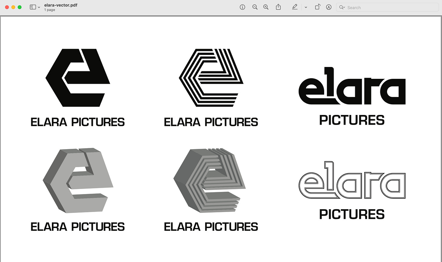
Blackbird Spyplane: One of the most recognizable things you’ve done is the Elara logo, for the Safdie brothers’ production company — which blew up when ppl like Timothée Chalamet and Emily Ratajkowski started rocking it on caps. Can you walk us through the process of that design?
Teddy Blanks: “It’s so funny — it’s that thing where you never know what’s going to happen to something after you design it. I spent so little time on that one. I was doing the titles for Heaven Knows What, and Josh and Benny were, like, we need a logo. Josh kept writing me emails like, ‘Elara Pictures is the future’ and ‘We have big plans,’ and he kept bugging me, like, ‘Any progress on the logo?’ So finally I sent him a pic of my laptop, just to show him I was working on it, and the final logo was actually in that pic. I intended it as a placeholder, and when I sent him the first round of options a few days later I actually didn’t include it, because I thought it was kind of awkward.

“I was looking at the logos for Orion Pictures, Cannon Films, these YouTube compilations of ‘80s VHS logos, trying to do something in that mold, and I did a weird thing where the bottom of the ‘e’ curves around to try to connect to the ‘a’ and the ‘l’ is cut off. I wanted to do an ‘80s thing were all the letters connect, but these are hard letters to connect so I didn’t send that one. But Benny was, like, ‘What about the one in the first photo?’ They ended up going with that, because all of these ‘80s logos look a little fucked-up and like someone is trying too hard.
“It felt so unrefined to me, I never thought it would become, like, a hot fashion item. And they were always great filmmakers, but then they went into stratosphere, and now they’re some of the best people doing it. So when I look at it now, it obviously seems like the best choice. They knew something I didn’t when they saw the little sketch I made.
“Obviously part of the the logo’s popularity is that it’s associated with them. But that’s why iconic logos become iconic — because they’re associated with a thing that’s iconic. That’s why you could never draw something like the Nike swoosh and show it to a client cold — they’d go, ‘What is that?’ By the way, they still owe me a hat!”
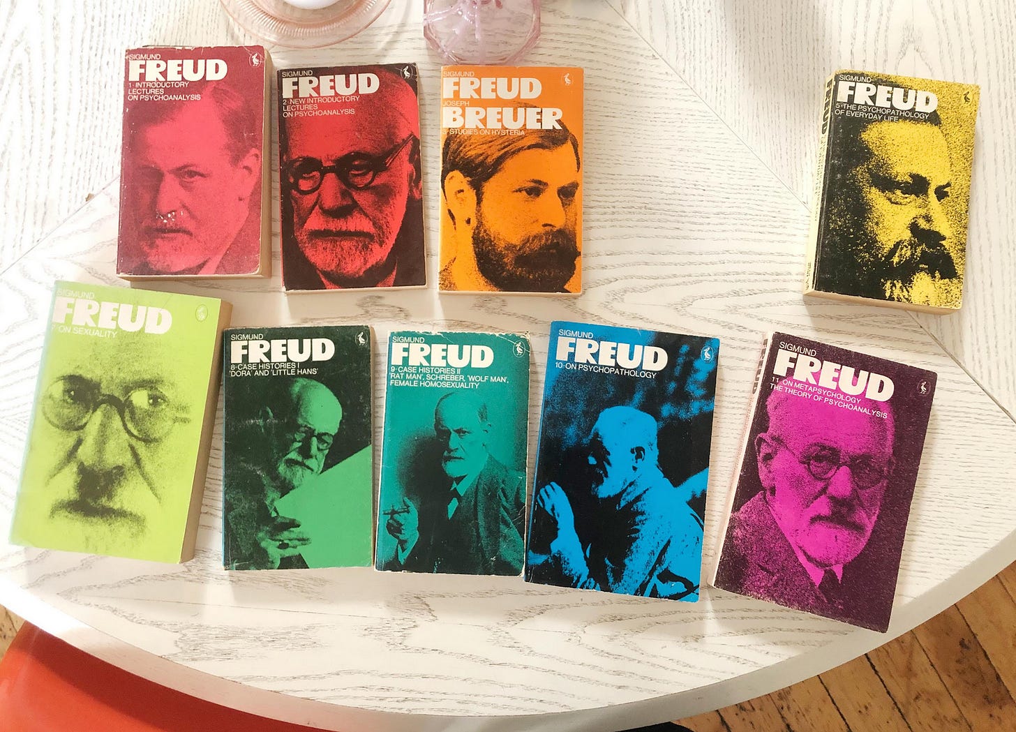
Blackbird Spyplane: F**k, I was gonna ask you for one. All right, you sent me pictures of a few possessions you cherish — tell me about these beautiful Freud books… This font is great!
Teddy Blanks: “This is my collection of the UK Pelican Freud paperback series, not entirely complete — they’re important to me because I stumbled upon them the first time I went to Paris, in 2014, at the Abbey, this amazing English-language bookshop. They have this basement full of shelves buckling under the weight of being way too stacked, so I was down there and I saw these. It’s a font called Op-Letter, which I’d never seen before, and I was like, This is really cool — at the time it was this old typeface, not available digitally.
“Also I was in therapy for the first time, and getting into therapy as a general concept, so running into a cool series of Freud books was especially exciting. I started hunting around that store and was able to find 3 or 4 more. I only wound up reading the introductory lectures, the rest sit on my shelf.”
Blackbird Spyplane: What’s up with this funky movie poster you sent? The first place my mind goes upon seeing it is “Fernand Léger if he did pop art”…
Teddy Blanks: “This is the German poster for Jonathan Demme’s Something Wild, my favorite movie. What I love about Demme is that there’s something exciting in every frame, which makes his films feel totally alive — like, even the extras are always doing something weird. With Something Wild specifically, this crazy thing happens tonally, where it starts like a madcap rom-com and then becomes this dark psychological thriller. It has a great downtown ‘80’s vibe, sort of like a companion piece to After Hours… The titles are by M & Co., who did titles for a few different Demmes — Silence of the Lambs, I think, maybe Swimming to Cambodia. I like all of them, because there’s not a lot of cool New York graphic design studios that do film titles, and I’m obviously working in that mold.
“I love that you can go to Posteritati and find some Polish movie poster that’s so much crazier than the U.S. one-sheet — and I think that’s a great way to put a poster on your wall, just get a weird foreign one for a movie you love. This one’s particularly great, with the high-heel fitting directly over the guy’s nose. I don’t know how I’d describe the style here — the font feels very German in contrast to the wild ‘80s illustration.”
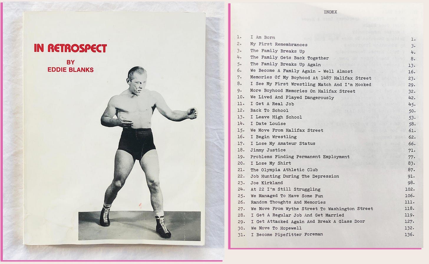
Blackbird Spyplane: O yeah, Posteritati has so much cool s**t! OK the last thing I wanna ask about is this self-published autobiography by yr grandfather Eddie. First off, what is the title font?
Teddy Blanks: “There’s a few fonts in the same family that all came out between 1970 and 1975. It might be Blippo or Pump… there’s another one called Bauhaus that’s in this same vein — the letters are rounded and don’t fully connect, like a partial-stencil quality.”
Blackbird Spyplane: So cool — it looks a lot like the font Campmor uses (above), which is this gorp store in Paramus that my pops drove me to a lot as a kid… Yr grandfather looks cool as h*ll, who was this buff introspective king??
Teddy Blanks: “He died when I was 10 years old, but back in the 1930s he was a pro wrestler in southern Virginia, named Red Devil. He had that thing that boxers get, cauliflower ears, and I remember very clearly that above the TV in his house there was a bronze mold of his cauliflower ears on a plaque. His wrestling career is what the book is mostly about. I’ll flip through it, but I also just love the table of contents — any autobiography where the chapter titles are, like ‘I Am Born’? I’m in. The whole thing was typed out by his wife, as he dictated it to her. He just wrote it for his family, which, you know, everyone should do.”
Blackbird Spyplane: It’s such a clean cover — when I first saw it I wondered if maybe you’d designed it for him…
Teddy Blanks: “No! The design is so good, and the picture of him is obviously great, but I’m assuming it was just a default layout option from some local printer. There’s so much vernacular design stuff from the past that we look at now and it’s, like, Wow, some genius picked the right font out of the 3 that were available at the print shop, and they made this cool thing.”
🍃 Teddy’s site is here and he’s on Instagram here. He also makes cool tees and zines with SpyFriend Molly Young, who we interviewed here.
🍃 For more home-décor tips like Posteritati peep our HOME-GOODS SECTION in the Spyplane Master Jawn Index.
🍃 Have fun with a Blackbird Spyplane “Cla$$ified Tier” Subscription to improve yr quality of life, access a bunch of elite exclusive s**t, and rock with this rare & miraculous newsletter 2 the fullest:


so this is the saint who created the lady bird titles which created my obsession for that medieval yet elegant font known to me as LUKE, bless their soul!
The headline misspells IRONIC??