You look fresh out the hothouse ma
Popping high-summer shades, ill hot-girl-summer knits, incredible ceramics, a wild art book & more
Welcome to Concorde, a bimonthly edition of the sletter where Erin takes the lead. You could call it a women’s vertical, but the insights, intel and “cute swag information” transcend gender.
The full Concorde archive lives here…
Heyyy, it’s me (Erin) back again with this blessed spinoff sletter creation. Today we’ve got:
A summer-color trend report / cheat sheet to let your inner hothouse flower FLOURISH
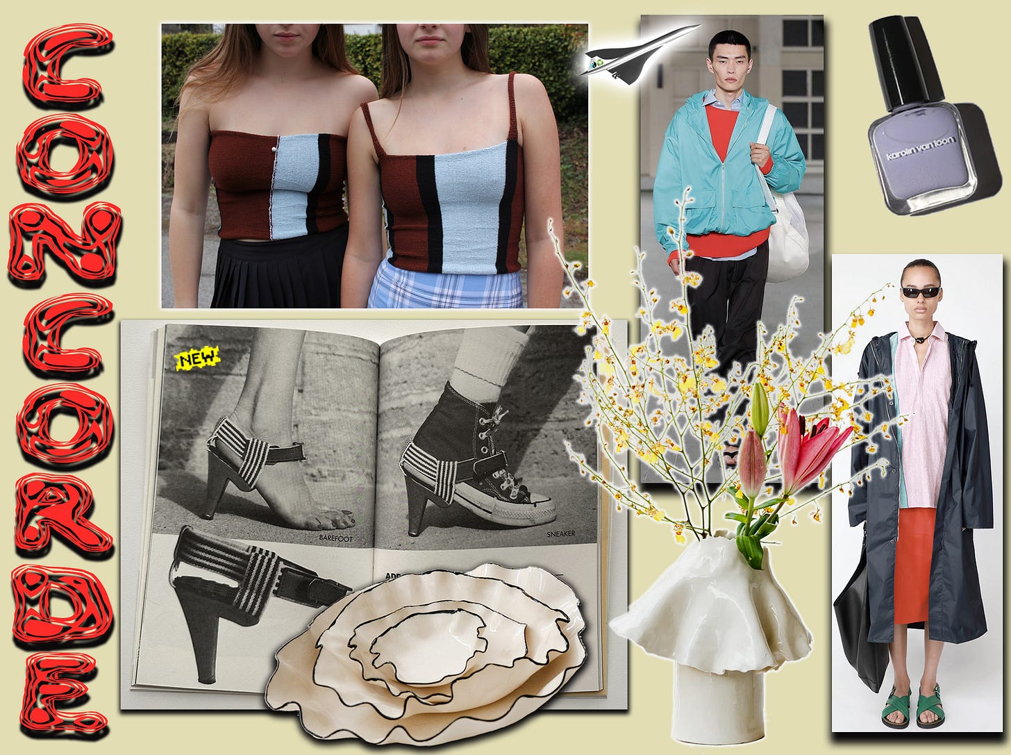
“Sexy mama”-tier knit tanks and tube tops
Unreal ceramics
A vibey unhinged brilliant vintage sauce inspiration art book, newly reissued
And so much more
Let’s get to it!
Wearing color… nothing could be more wonderful, and yet it’s something that freaks people out and gets them all up in their heads with risk-averse WORRY…But what is summer if not the season for risk-taking, lovers? A time to create frisson-inducing fits that echo the pleasant shock of an ice cube thrown down your shirt…. Except in this case that metaphorical ice cube is getting thrown down your metaphorical eyeballs!
There’s one variant of “pleasantly shocking color combo” I’m particularly feeling right now — I’ve been seeing it on the streets, on the runways, and on the feed, and it slaps.
In all cases, you start with vivacious tomato reds, then branch out from there to a trio of other closely related colors. We made a mnemonic to lasso it all together:
Wear red across the A.L.P.s (Aqua, Lilac & Pink) !
For the most part, I’m talking about combining red with one of the A.L.P.s like in the two NYC street photos below, which goated costume designer Miyako Bellizi recently posted: red + aqua (pic 1) and red + lilac (pic 4).
Or take the recent Auralee SS24 show. They paired lots of hot reds with black, but this aqua windbreaker combo below in pic (2) goes almost as hard as the model’s cheekbones — d*mn!
Molly Goddard’s SS23 collection combined lilac dresses with ruffly bags in red and aqua, seen above in pic (3). (There were also lots of cowboy boots and sheer off-the-shoulder dresses… It makes me wonder if Molly had True Romance1 in mind, which is cooking with all of these ingredients.)
And can you even count how many colors are COMMINGLING on this SS24 look from The Row above in pic (5)? We’ve got a pale pink shirt with an aqua streak, paired with an orange-red skirt … plus emerald green sandals, a navy coat and black bag. Highly advanced sh*t!!
For some au courant ‘90s vibes, check the shades of purple, pink and red in the 1999 Self Service editorial above in pic (6), spotted at the great IG account Sportsman Paradise (shot by Horst Diekgerdes and styled by tha god Camille Bidault-Waddington).
Why do these color configurations look so good? How is it that they balance surprise and harmony so deftly? On some color-theory s**t, it’s because they riff on the classic complementary relationship between blue and red, but whereas that combo, when done straight down the middle, is surprising to no one, if you shift the red into a saturated, orange-tinged Jersey Tomato hue, and shift the blue into a vibrant Aeagean Sea aqua, it creates a beautifully muted electric jolt. Lilac and pink both have red in them, of course, so they’re happy together, but especially in these pale shades. And if you keep the tints (i.e., the relative amount of white) of the A.L.P.s the same, you could even wear all three with red at the same time.
For those who don’t already own something in these colors, here are some great pieces to GET U GOING:


