


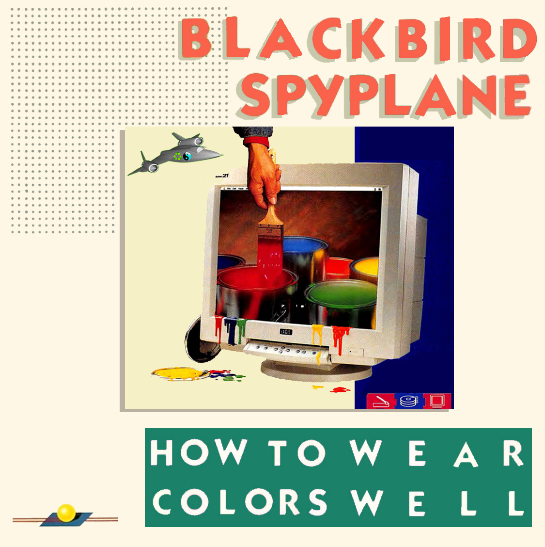
How to wear COLORS well
How to wear COLORS well
Hue-rocking at Mach 3+ levels — "The Spyplane Way"
Welcome to another landmark installment of Blackbird Spyplane.
Our interviews with Jerry Seinfeld, Tyler, The Creator, Emily Bode, Online Ceramics, Seth Rogen, André 3000, Nathan Fielder, Lorde, John Mayer, Danielle Haim, Daniel Arnold, Thomas Mars from Phoenix, Phoebe Bridgers, Chris Black, Naomi Fry, Michael Stipe, John Wilson, Rashida Jones, Hayley Williams, Ezra Koenig and more are HERE. Our profound essays are HERE.
We remain YOUR No. 1 100% reader-supported electronic-mail style & culture masterpiece, so join our Cla$$ified Subscriber Tier for the full Spyplane experience — Jonah & Erin
Color — this s**t is all around us! Shout out to flowers & birds who rock beautiful colors in breathtaking combinations to look fly & propagate, but also shout out to piles of barf who “rock” repellent colors “in order” to look wack & warn our scavenging brains away to safety on some evolutionary s**t …!!
Nine times out of 10 the wise contemporary clothes-rocker would prefer to dress like a beautiful warbler than a pile of barf (at least one time out of 10 U gotta challenge convention 😉). But how to achieve “warbler-caliber colorful swag” ?? The other day reader @danredmohler wrote in requesting some straightforward “rules of thumb for harmonizing colors in a garment tableau?”
Spyplane co-pilot Erin is a professional COLOR WHISPERER who used to work as a color forecaster and at her current job collaborates closely with designers focused on color design. She also loves a “chromatically bussin’” fit, and today Erin is generously blessing us all with some color-savant widsom….
UPDATE: the must-read “How to Wear Colors Well Part II: Tonal Swag” is here.
First up, some caveats —
🎨 Color can be vexing & perplexing even to “the pros,” because everyone perceives it differently — peace to Ludwig “Fittgenstein” Wittgenstein, who tackled the epistemological slipperiness of color time & again in his philosophical writings, all of which we’ve read and understood. Relatedly, Blackbird Spyplane is NOT a prescriptivist, rule-slinging sletter: Sometimes an ostensibly “clashing” color combo can work, thanks to a confluence of tangibles & intangibles.
🎨 In other words, we are not trying to hit U with a list of “Color Matching Dos and Don’ts.” No, baby: Far more dopely, we’re blessing you with sturdy guidelines for how to rock colors that “go” together in 2022, i.e. techniques for identifying & building color combinations that look good now, because two colors might share some simpatico color-wheel affinity but that doesn’t mean they look cool together. Cultural contingencies play a major role on that score: Some color combos evoke certain eras and bygone fads (some worth revisiting, some not); other color combos evoke swag-free holiday decorations; some evoke omnipresent corporate imagery — e.g., blue and yellow objectively “go” with each other but the question remains of whether U R trying to dress like an IKEA shift manager (you might be, and the fit might go hard, but that’s not a matter of color harmony).
🎨 Variables like skin tone, hair color, and eye color all contribute to a fit’s “color profile,” too, but in ways we think it’s a FOOL’S ERRAND to try to taxonomize, not least because there’s an impossible-to-quantify relationship between color & personality! For instance, Erin is “not a soft pastel person. That’s not what I want to convey to the world. But other people look great in pastels, so play around and see what feels good to you.”
That being said?? Groove upon these techniques.
TECHNIQUE #1:
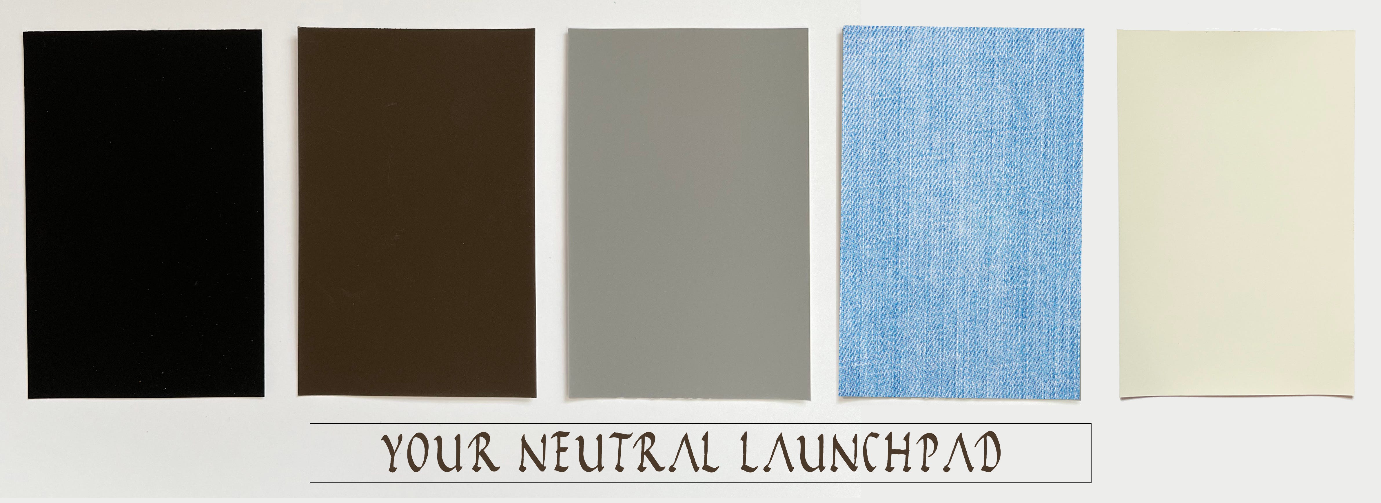
Use a neutral as yr “COLOR launchpad” and work in one other color — any color U choose.
Neutrals… O mama! They’re the heavy-lifting, journeyman staples of a wardrobe, and — as 2022 collections from The Row, Lemaire, Sandy Liang, Lauren Manoogian, ALD, Louis Vuitton, Evan Kinori, and Our Legacy (among others) demonstrate — they can also be “stars” in their own right.
With that in mind, one simple, can’t-miss way to mix colors HARMONIOUSLY is to add 1 chromatic color to a popping neutral base.
That base could consist of blacks, grays, whites*, browns or, for our money, blue denims, which — since they’re melanges of different blues — tend to hit the eye, functionally, as neutrals. (Some navies and olive- and khaki-greens work as neutrals, too, on a fit by fit basis.)
To illustrate, let’s build our neutral base using browns — mmm big, chocolatey, fresh-ground-coffee, rich-loamy-terroir lookin’ a** browns — which have been having a deserved “moment.” I (Jonah) have been going hard with brown jawnz lately, indebted in no small part to Mach 3+ brown-rocker Tyler, The Creator: “Brown really goes with almost every color,” he told me during his Blackbird Spyplane Interview . “I wear a lot of pastels, and it’s a great base for that.” Brown — a mighty SUPER-COLOR composed of MANY CONSTITUENT COLORS — looks good now and will look good forever, because even though it’s more or less “on trend” at any given time, it’s a neutral so (like black or blue jeans) it goes with everything …
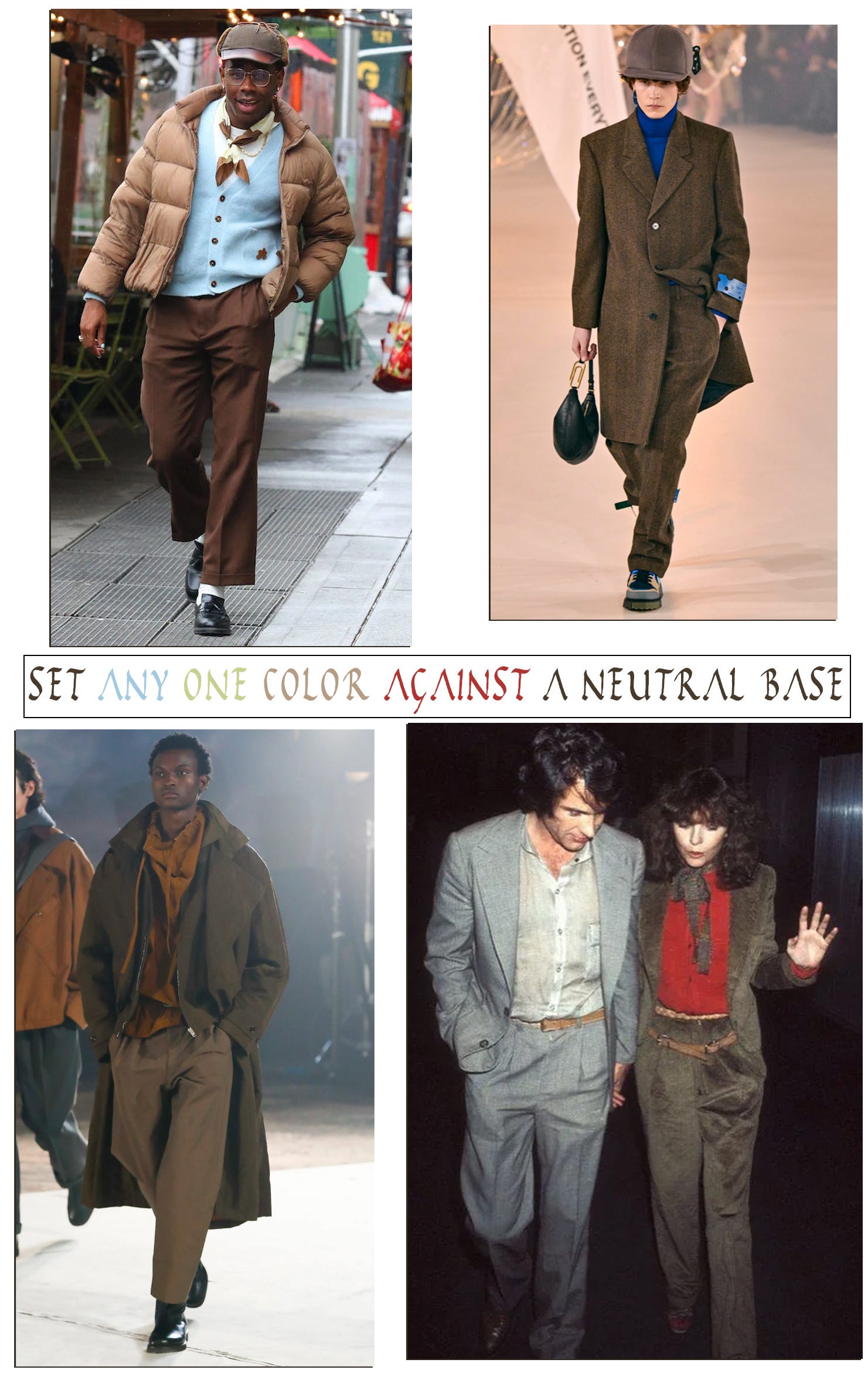
So whereas Tyler (top left above ) likes using brown as a base for pastels, you can see how it works just as well with ultramarine (the Off-White FW22 runway shot top right); pinkish red (the vintage paparrazi shot bottom right of Diane Keaton chilling with an all-neutrals Warren Beatty, snagged from SpyFriend Lawrence Schlossman’s IG moodboard, linked below); and rusty orange (the Lemaire FW22 runway shot, bottom left above.)
Again, we chose brown to illustrate this principle ‘cause brown is popping, but any neutral base will behave similarly.
* White is notably unlike the other neutrals in that if you rock a white shirt, cap or sneakers the effect is as “classically unassuming” as it comes, BUT if you give more real estate to white — i.e., combine multiple white pieces OR even just rock white pants or a white jacket — you’re making more of a “statement” than U would be making with any other neutral. The easiest way to “tone down” that statement is to literally “tone down” the white — i.e. go eggshell / ecru.