Why do new cars look like this??
"Wet Putty" whips are everywhere. What’s behind it? ... a BBSP investigation
Welcome to Blackbird Spyplane, your 100% reader-supported electronic-mail life-improver.
Our interviews with Nathan Fielder, Jerry Seinfeld, Tyler, The Creator, Emily Bode, Online Ceramics, André 3000, Matty Matheson, Lorde, John Mayer, Danielle Haim, Ebon Moss-Bachrach, Daniel Arnold, Thomas Mars from Phoenix, Phoebe Bridgers, Michael Stipe, Héctor Bellerín, John Wilson, Mike Mills, Ezra Koenig, Action Bronson, Seth Rogen and more are HERE.
Blackbird Spyplane is well-established as the no. 1 source for “unbeatable musings” on visual culture in all its forms, and while we tend to focus on mad-cool developments in clothes and home jawns, sometimes our critical gaze dilates to include, e.g., perplexing developments in cars.
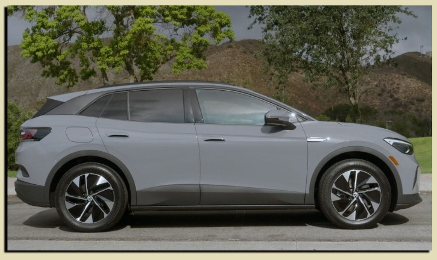
Case in point: Last summer we met up with friends for a hike, and they rolled up in their new whip — a VW whose gray paint-job seemed, somehow, to be matte and glossy at the same time…
The effect was sneaky but striking… the VW looked more uniformly smoothed, and as a result more visually dense, than yr typical car — sort of like it had been formed out of wet putty. Paradoxically, the paint job was so “muted” that it drew our attention way more than any of the other regs-painted cars at the trailhead…
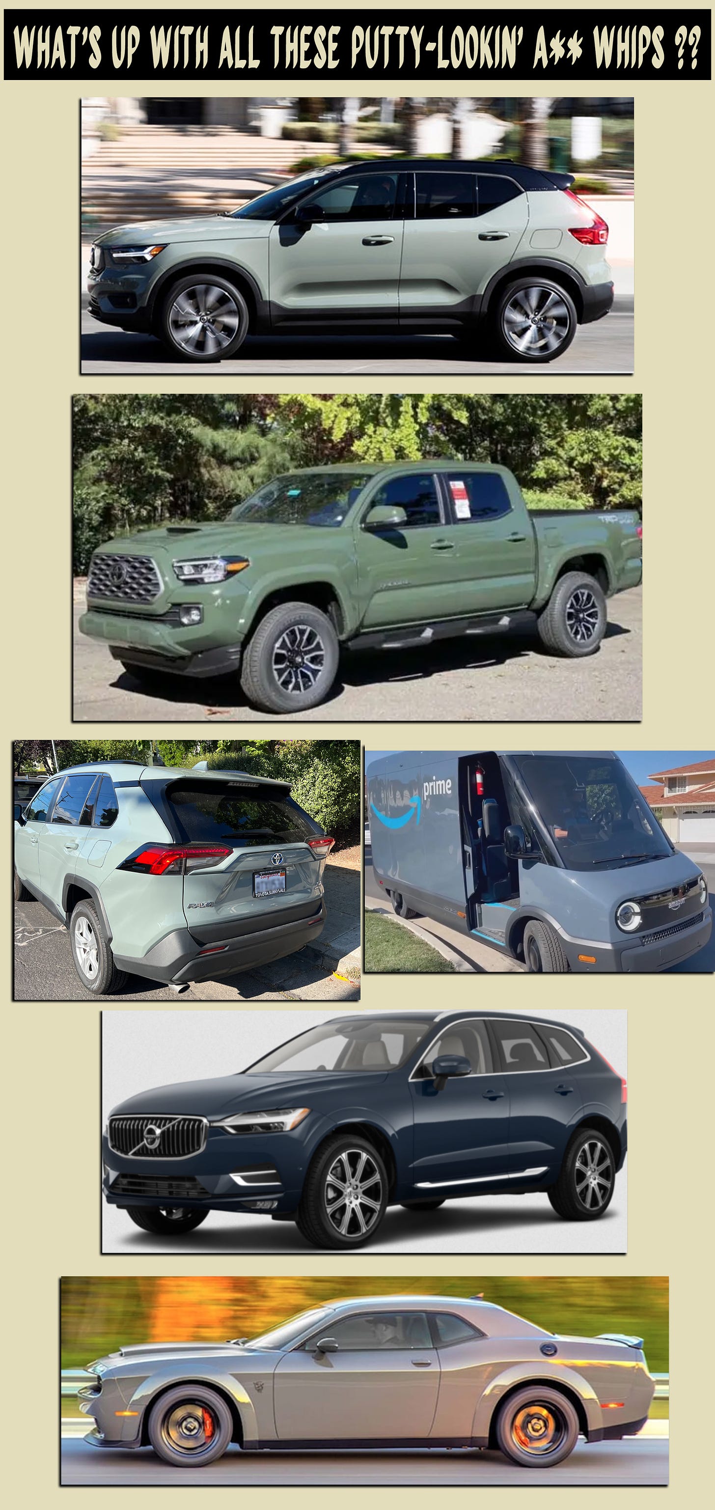
Have you clocked these s**ts?? In the last year, wet-putty whips have gone from “bubbling” to ubiquitous, to the point where now we can’t leave Spyplane HQ without clocking Nissan Kicks, Honda CRVs, Dodge Challengers, Toyota Civics, Chevy Volts, Hyundai Elantras, Polestar 2s, Jeep somethings, Mini Coopers, Volvo trucks, Subaru wagons and cursed Am*zon delivery trucks, ALL with this same kind of smoothed-hue paintjob …
The colors tend to be straight-up grays, or greens and blues and even oranges that have been dulled over with gray shades, then given a glossy topcoat. It’s an effect that announces itself more prominently I.R.L. than in photos, but these will give you an idea of what we’re talking about:
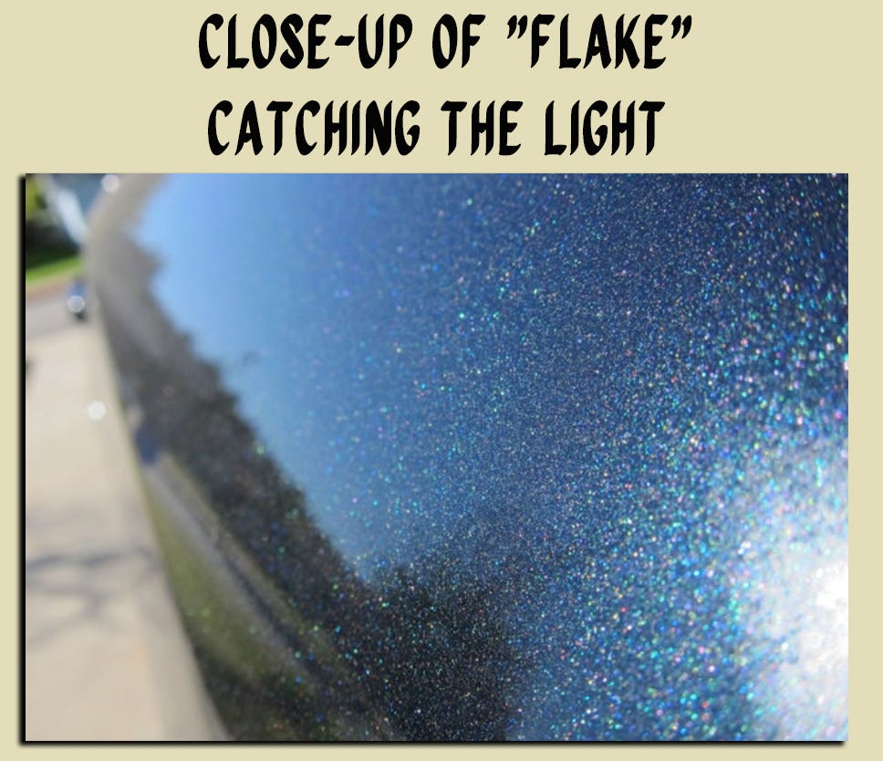
On the most concrete level, what’s happening with these paints isn’t just that they are significantly grayed down, but that they contain a very low amount, if not a total absence, of “flake” — the tiny metallic flecks that car manufacturers have been mixing into paint for decades, which makes their vehicles sparkle and helps highlight their (ostensibly) seductive, undulating lines…
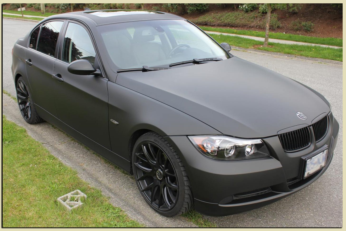
Without any flake, a car’s texture appears smoothed and its lines are de-emphasized. The extreme version of this zero-flake look is the classic matte aftermarket “murdered out” paint-job, e.g.:
The wet-putty cars we’re talking about have a glossy overlay that murdered-out cars don’t, but when you encounter both of them I.R.L. they reflect less light than we’ve become accustomed to seeing over the past several flake-heavy decades, and so they assume a greater visual density than their flaked-out counterparts.
The result is faintly but palpably uncanny, almost as though a computer-rendered object has somehow infiltrated the real world, beholden to a slightly different set of physics…
We were eager to subject this s**t to more than just brilliant Spyplane Speculation, so we asked illustrious automotive journalist & Spyfriend Hannah Elliott about the “wet putty” wave. She came thru with wisdom:
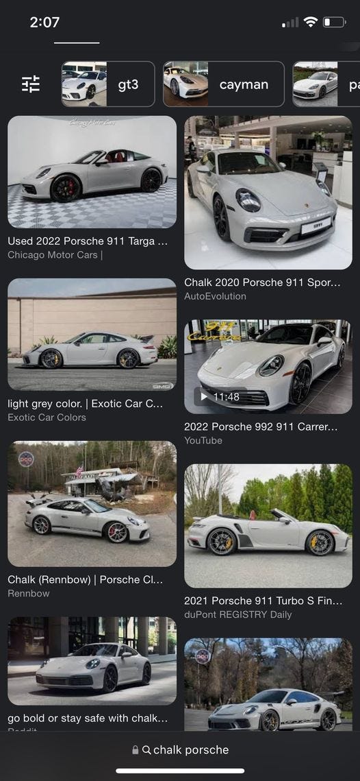
“So, chalk is a super famous and popular paint color for Porsche. It started as things like ‘Pearl Grey’ and ‘Heron Grey’ on 356 Porsches in the 1950s and ‘60s. Then maybe like 5 years ago or so, Porsche brought back the color for its modern 911 — and they called it ‘Chalk.’ That’s the grey putty color I think you’re describing. (It may have been a debut color for the Panamera as early as 2017, I’d have to check that.) But anyway it’s ubiquitous among Porsche people:
“The main characteristic,” she confirmed, “is that it lacks any sort of flake or metallic sheen, as opposed to the silver metallics and brown-copper metallics and ice-green metallics that defined Porsche Turbos of the 1970s. Sometimes it almost reminds me of a Parisian grey, but often it falls a bit flat and is closer to how you describe it: Putty.
“My guess is that the mass brands introduced their grey tones after Porsche brought it back, and it proved to be a popular color. Typically the luxury marques set the tone for design elements like this, which are then emulated by others.”
UPDATE: A few ppl have also mentioned the important role of the “Nardo Grey” paint color from (Porsche-owned) Audi in this timeline — a wet-putty hue that came out in 2013 and became a car-head phenomenon.
Erin & I were trying to put our fingers on why this anodyne trend irks us and even feels a bit cursed, and then it hit us: beyond the automotive-world, the boom in these wet-putty cars is part of a broader mainstreamification of gray-shaded consumer-good colors heavily targeted at younger Gen-X-ers and Millennials:
We are talking, e.g., ~2014-era Dwell house pictorials, Heath Ceramics jawnz, Kinto thermoses, a bunch of the new Technivorm Moccamasters, Mepra flatware, and “popping” PVC kicks from Crocs to Bottega Veneta Puddle Boots, etc., etc.
Colors that a decade or so ago signified affluent “creative class” discernment and cachet (“whoa — a cool young architect probably lives in that slate-grey house”) spread outward to, like, the “haute-basic” Food52- / Target-home-goods-section realm (“this Airbnb kitchenette has the cutest cutlery”), and has now gone full mass-market supernova, appearing on cars from all the major manufacturers (“This isn’t your mom’s Camry.”)
Subjecting bright colors to gray-shaded dulling is ostensibly a concession to sophistication and restraint. In the context of wet-putty whips and other contemporary consumer products, though, this strikes us as a hedged, half-stepping, and underhandedly infantilizing approach to color design all the same — a way, basically, to sell millennials “grown-up” toys within a smokescreen of ersatz refinement.
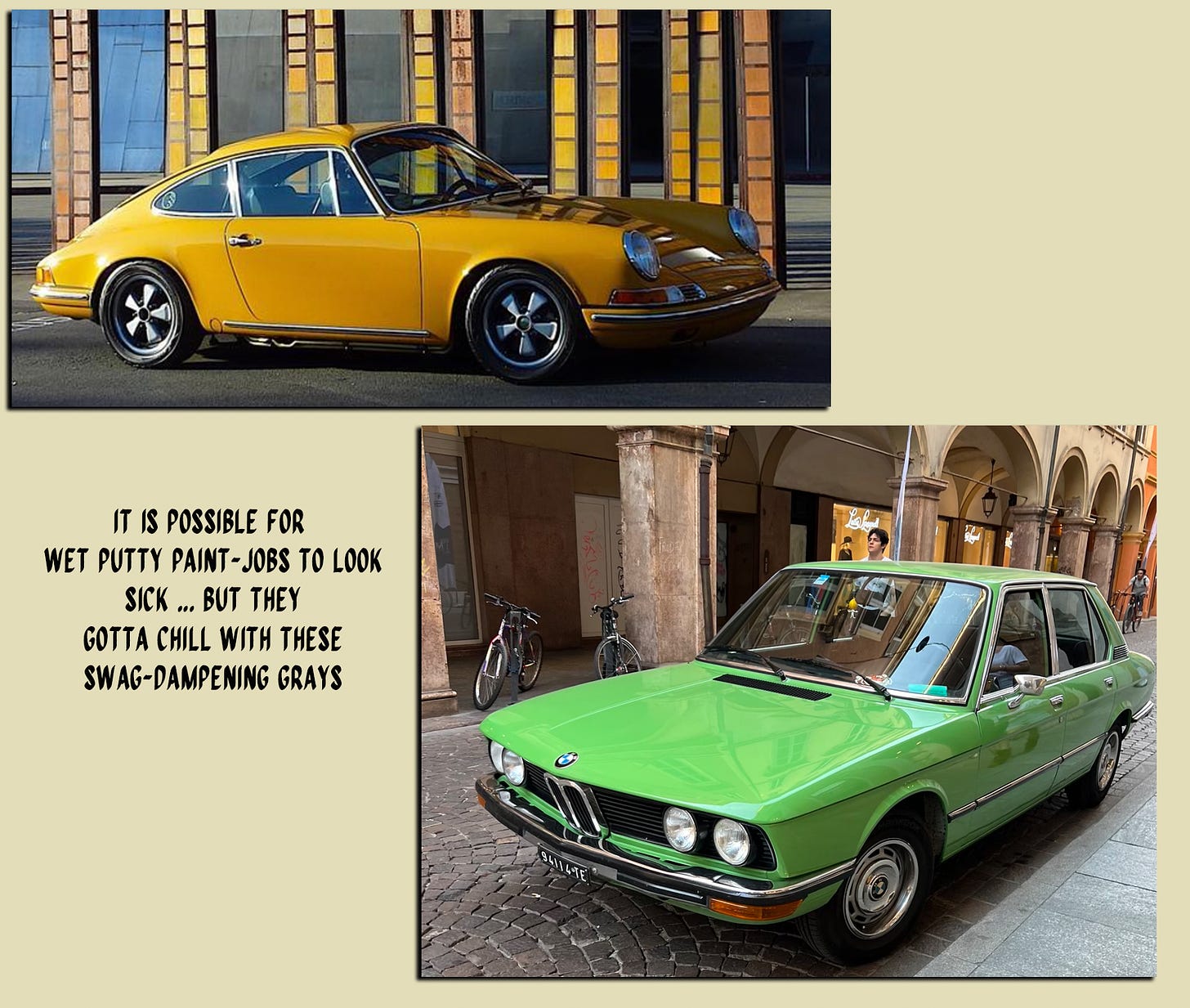
Or, put another way: Just commit to a bright, beautiful, audacious color, no need to dampen it with these swag-depleting grays! Sick cars used to do this all the time...
The green on the BMW 518 directly above, for instance, seems like it was just tinted with whites, zero gray in sight… And the “Bahama Yellow” Porsche above it is a patently beautiful and “sophisticated” yet vibrant hue that has maybe been toned somewhat with gray, but not so much that the life has been suffocated out of it.
The Porsche pic came to us, as it happens, via our buddy who copped the “moonstone grey” VW last year. He is a man of Considered Aesthetic Opinions, so we asked what he thought about the new “wet-putty” wave at large. “The funny thing is it totally depends on the color,” he said. “The yellow Porsche is perfection, but these new grays and gray-greens are so hideous.”
It’s a prime example of how a jawn that felt surprising and fresh in isolation, upon first encounter, can curdle into distaste once you realize it’s just one node among many in a broader marketing trend of which YOU are the demographic target.
“I don’t think I knew what my opinion on this look was before we got one,” my friend said, “but man, I f**king hate it now.”
P🎨E🎨A🎨C🎨E🎨 — Jonah & Erin






Yoooo I can’t believe it but the BBSP was referenced on a Hank Green vid lolll https://youtu.be/KchX52bIZSg?si=81cqjzLHVx3EdwOx
This goes for bicycles too.. I ride a 2006(?) Trek 6500 SLR with a superb orange/yellow gradient (sunburst style). It is my pride and joy partly because you never ever see bikes with two-tone jobs or the slight sparkle any more! Everything is gloss grey or dark blue block colour.. so boring